
DISPLAY CAPABILITY
OF
PRINTING AND ELECTRONIC DEVICES
Last Update: July 2009
Rhodonine™ and Activa™: See Citation Page
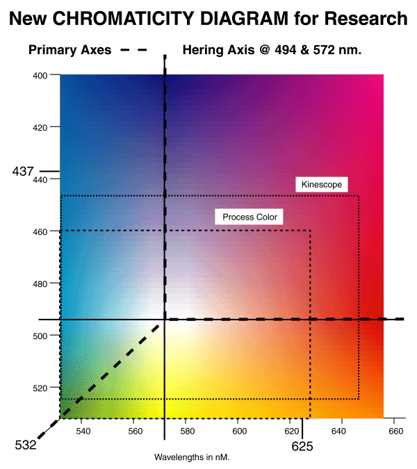
The New CHROMATICITY DIAGRAM for Research provides a convenient method of
describing the capability of various image reproduction systems to excite the human
eye.
Beginning with the New CHROMATICITY DIAGRAM, it is important to note that the colors
used to illustrate the diagram on this site are not true. No display device or conventional "process"
printing technique can generate the full range of colors perceivable by the human
eye. To properly portray the entire chromatic range of the eye on a cathode ray tube type of
monitor requires that one of the phosphors have a peak irradiance near 400 nm.,
a second have a peak irradiance near 655 nm. and the third have a peak near 532 nm.
To print a test sample using conventional process color that would
properly represent the entire perceptual spectrum of the eye would be quite difficult.
High quality printing designed to reproduce paintings typically employs six different
inks instead of the conventional three colored and one black inks of CYMK printing.
These inks include a violet and a red along with the conventional cyan, yellow,
magenta and black. To reproduce a particular color properly, recourse is frequently
made to what is called "spot color." Spot color printing introduces an additional
ink with the specific spectral characteristics required to reproduce a particular
color such as in a trademarked logo.
The following figure describes conceptually the color reproduction capability
of various systems in common use when viewed by a neutrally adapted human eye (nominally adapted to a 6500 Kelvin light source, a.k.a. daylight or illuminant C). The specific wavelengths achievable by a particular
monitor depend on the particular phosphors used.
- It should be noted that the phosphors used in conventional television sets
are different in the United States and in Europe. Similarly, industrial and computer
monitors may use specialized phosphors. It is critically important in vision
research that the specific phosphors used in experiments be noted.
As in the case of monitors, the chromatic range achievable
by a particular process color press depends on the specific inks used. In the case of
both monitors and presses, the capability is generally less than that which
the eye can perceive.
Recently the difference between the inks used in some European presses and those used in the USA has become obvious. The spectra by Dowling printed in the European book "Color Vision:Perspectives from different disciplines" by Backhaus, Kliegl & Werner (1998), pg 48 are noticably deficient in a saturated blue but provide a distinct purple not available in books printed in the US. Compare with the same spectra due to Dowling printed in "The Perception of Colour" Gouras (1991), plate 9.
Recently, great efforts have been made to standardize the color reproduction
capability of computer generated color imagery, whether destined for a display device
or a printed page. This is a difficult problem. The printing industry has proceeded
in one direction and the display device based industry has proceeded in another.
The activity of the Microsoft Corporation, and many standardization
organizations that have chosen to follow their lead, must be noted. Until
recently, it has been conventional to assign digital values associated with each
of the chromatic outputs of a cathode ray tube monitor ranging from zero to 255
(0 to FF in hexadecimal notation), with the higher number associated with full
saturation of the output in that color. Using the conventional sequence of defining
colors as RGB and the convention of additive color mixing, white is defined as the
hexadecimal value FFFFFF. Because this convention has produced inappropriate
amounts of green in many pictures, Microsoft has defined saturated green as an
intensity level of 80 in hexadecimal or 128 in decimal. They have assigned the
name "lime" to the color corresponding to the value of FF, or full saturation,
in the green channel. This procedure is somewhat counterproductive
in that it ties the reproductive capability of most computer programs to a
limited range of vision represented by three unspecified phosphors. In the long
term, it would be better to associate the computer values associated with a
given color to include the extreme perceptual capabilities of the human eye.
As a result of the different approaches taken by the printing and the display
device oriented industries, great care must be taken in vision research to
understand what color palletes are used by a given set of equipment.
Color gamut of Kinescope devices
The above figure shows the color gamut of kinescope devices using the perception-based New Chromaticity Diagram. The figure below shows the same gamut for kinescope devices on the obsolete but still widely used CIE 1931 Chromaticity Diagram incorporating the isoclines of the perceptual diagram. The observing eye is assumed to be neutrally adapted as above with the white point (x = y = 0.33) corresponding to 6500 Kelvin.
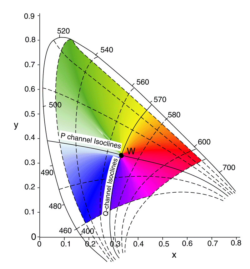
The figure is drawn for a set of phosphors peaking at 460, 525 & 645 nm and exhibiting negligible spillover of the pixel generating mechanism between phosphor elements. Note the four cornered character of the presentation, in accordance with the Perceptual Chormaticity Diagram. Note also the curvature of the loci forming the color space. These loci are critically important in describing colors as perceived by the human observer. The curved loci significantly impact the calculation of metamers.
Metamers are lights occurring at equal "distances" along a radial passing through the white point in perception space. The distances need not be equal nor need the radial be a straight line when represented in the CIE 1931 chromaticity diagram.
It must be noted that the chromaticity coordinates provided by many manufacturers are based on measurements made using a fixed-filter spectrophotometer calibrated using various CIE and SMPTE guidelines. These are typically based on the additive concept of color vision rather than the orthogonal zone theory described here. A collection of kinescope and other display devices coordinates based on the above situation are
available courtesy of Earl F. Glynn.
It must also be noted that many investigators have described the color gamut of the human eye using the CIE 1931 diagram and a variety of assumptions about the spectral performance of the human eye. Some of these representations differ remarkably from the real world. The presentation by John Walker, Colour Rendering of Spectra, April 1996.
http://www.fourmilab.ch/documents/specrend presents a particular example based on the peaks in the x,y,z color matching functions of the CIE. Walker's representation (labled the SMPTE gamut for the two degree Standard Observer), also shown in Glynn and based on peak values of 448, 555 & 599 nm, shows a narrow triangular kinescope gamut that does not extend significantly into the green portion of the CIE 1931 Diagram. It is not obvious why Walker used the x,y,z color matching functions to represent the peak spectral absorptions of the human visual system. As noted by Wyszecki & Stiles (page 138, "The X,Y,Z primary stimuli are nonreal or imaginary, that is they cannot be realized by actual color stimuli."
References
Wyszecki, G. & Stiles, W. (1982) Color Science: Concepts & Methods, 2nd Ed. NY: Wiley & Sons